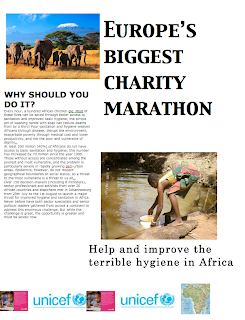
When I started doing my poster I just took several pictures from google, and decided my whole back-round should be a very colorful map of africa, additionally to that I had like 4 pictures and logos that were all very colorful. My writing was pretty big and the pictures were also bigger than they were supposed to be. In the end it looked horrible, very very colorful and all squished on to the page. I didnt like it at all and after I read proximity I disliked it even more, but now I knew how to improve it a little. I was instructed to change the poster, but not to add or take anything away. I was frustrated, because did not know what to do with those many things on my poster, I decided to make my back-round map tiny and put it next to my logos, just to show what the actual event was for. Then I made the pictures and the writing smaller, I put the picture that had something to do with my paragraph and my title next to that and put all the things that had something to do with each other next to each other "to make them look like one". Now in my opinion my poster looks better and I have applied proximity to it.
Keine Kommentare:
Kommentar veröffentlichen