Dienstag, 30. September 2008

HELVETICA NOTES

HELVETICA


Helvetica is used in brand names, street signs, and logos.

Helvetica is simple, neutral, and easy on the eyes, sans serif; letters have uniformity to them.

Helvetica has perfect spacing. It’s a modernist font, which represents modern, space, easy, relaxed, but it is ubiquitous, it has come to the point where it’s like white space. It’s everywhere, so we get bored of it and it’s not cool, too simple, and too perfect. Its supposed to make you feel safe and “in”…but its bad for the designers, because its boring. It’s too vanilla, too corporate, and too institutional.

Its modern, cool, but modern is becoming retro.


CREATING A FONT:


Make an h first then an o and then a p then do letters like those just flipped around, like m,q,d, b.  

Horizontal slicing off of terminals.

Ex. Sears, Jeep, Toyota, Aprilia, Kawasaki, Target, Tupperware, Nestle, Verizon, conEdison, Lufthansa, Saab, Oral B, JcPenny, Fendi, Fifa, Adidas, street signs like Stop... Coca cola…old way…new coke in Helvetica.


Helvetica, rather than being authoritarian, beurocratic and oppressive, excess able, transparent and accountable.


Anti Helvetica Guy: Real Typeface needs rhythm and contrast….Helvetica ha neither. Needs lots of white space around it. All the letters look the same.

Typeface is part of branding. Branding is the projecting of qualities of the company.  


HELVETICA NOTES PART 2

Counter culture of the sixties overwhelms the modern movement before rise of flower power movement. No more straight and clean lines in fonts. 

In the 70's everyhing out of control, in 80's the "disease"

david carson...............

Maximo Vienelli- high priest of modernism (objective)

David Carson- high priest of post-modernism (subjective)


Grunge...and design!

_____________________________________________________________________________________

MODERNISM

-----------------------------------------------------------------------------------------------------------------

-Functionalism

-Utilitarianism

-Objectivist

-Simple

-Clean

-----------------------------------------------------------------------------------------------------------------

POST MODERNISM

_____________________________________________________________________________________

-Subjectivist

-Free form

-Chaotic

- Complicated


HELVETICA NOTES


-Wim Crowell a modernist. Designed city logos and school books.


-Michael C. Place, post modernist...says you can make helvetica speak to you in the way what its representing



Mittwoch, 24. September 2008

Design of the week 2.


Facebook Great Design


Facebook is a Great Design and this can be proved by the thousands of people who spend half of their day on it. Facebook recently changed its whole design. The whole site has been re-designed. I personally liked the older facebook, because it was very simple and the "important" and "interesting" things on facebook were visible at all times. ( such as pictures, peoples walls, information and profile boxes). The new facebook is a bit more complicated and its harder to see interesting things, because one has to click and find stuff, instead of just having it right there, like in the old one. Facebook is a great design, because it can be used by basically everyone and even though it has not been around for long, it is very popular. Facebook is a brilliant design, because it keeps people hooked to it for very long. It has achieved its goal, of not so much letting people meet random strangers, but let people communicate with people they already know and allow them to make their social networks visible to others and give their information out to friends. It also allows people to advertise themselves and this can also be dangerous. "Facebook isn´t just showing us information about what our friends are doing as a gift, its showing us information in exchange for money. They´ve altered the state of the relationship." The worst part is that facebook is selling peoples apparent private information to 3rd party sites. Still facebook is an amazing design, they have pinpointed the motivations of users at each step, and designed the screens in such a way as to make the default action the seemingly best one. They technically give you the option to get out of it, but they have designed the system in such a way to make it much easier to simply let it happen and make you stay and look at things that make you stay even longer and look at even more things.

http://bokardo.com/archieves/facebooks-brilliant-but-evil-design/

Fonts Notes


Concordant- A concordant relationship occurs, when you only use one type family without much variety in style, size, weight. It tends to be formal and sometimes dull.
Conflicting- A conflicting relationship occurs, when typefaces that are similar in style, size and weight. The similarities are disturbing, because they are not the same ( concordant) , but neither are they different ( contrasting).
Contrasting- When you make typeface really clearly distinctly different from each other. These are visually appealing and they are exciting to look at.

 Oldstyle: 

-Diagonal Stress
-Serif
-Serifs on lowercase letters are slanted
-Moderate thick transitions in the strokes

ex. Goudy, Palantino, Times, Baskerville, Garamond


Modern:

-Vertical Stress
-Serifs on lowercase are thin and horizontal
-Radical thick/thin transition in the strokes

ex. Bodoni, Times Bold, Onyx, Fenice, Ultra, Walbaum

Slab Serif:

-Serifs on lowercase letters are horizontal and thick
-Very little or no thick transition, or contrast, in the strokes
-Vertical Stress

ex. Memphis, Clarendon, Memphis Extra Bold, New Century Schoolbook

Sans Serif:

-No serifs anywhere
-No thick/thin transitions in the strokes
-No stress because there's no thick/thin line. 

ex. Antique Olive, Formata, Folio, Franklin Gothic, Futura, Condensed, Syntax

Script:

-Arid, Cascade


Donnerstag, 18. September 2008

Review Notes

Don't be afraid to: 

  • have free blank space.
  • be symmetrical
  • make words large or very small
  • make graphics very bold or minimal
Professional designers are always "stealing" other ideas- constantly looking around for new inspirations and ideas.

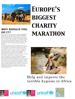
How I changed my poster after reading Contrast

I read contrast and found that my black writing was contrasting the best with the white backround. I found the white  back round boring, so I made it light-blue grayish. 

Africa Poster after Contrast

Dienstag, 16. September 2008

Contrast

Contrast is one of the most effective ways to add visual interest to your page- a striking interest that makes the reader want to look at the page- and to create an organizational hierarchy among different elements. 
-for contrast to be effective it must be strong. 
-contrast is not reached, if things are only slightly different...in this case conflict is caused.
PRINICIPLE: if two items are not exactly the same, then make them different. Really different.

Examples of contrast:

  • large type with small type
  • old font with new style font
  • thin line with thick line
  • cold with a warm color
  • smooth with rough texture
Purpose of Contrast- to create an interest on the page 
                                    - get better organization on the page

Contrast should never confuse the reader.


Donnerstag, 11. September 2008

How I changed my poster after Repetition( alignment)

I aligned everything perfectly and made the spacing between all the items the same. Then I made the fonts the same, but left the title a little bigger than the less important 2 titles. I titled the more important words in my titles. I resized my pictures and aligned them to the text and other items. 

Africa Poster after Repetition (a bit of alignment)

Mittwoch, 10. September 2008

Repetition

The principle of repetition states that you repeat some aspect of design throughout the entire piece. 
The repetitive element may be:
  • bold font
  • bullet point 
  • color
  • design element 
  1. can be the same over and over again, because this emphasizes what you want to show. 
  • thick line
  • spatial relationships 
Repetition=consistency 

repetition goes beyond just being naturally consistent- it is a conscious effort to unify all parts of a design. 

Purpose: to unify and add visual interest.


Dienstag, 9. September 2008

How I changed my poster after Alignment

I aligned everything and changed all the items that were centered, I aligned the things to items that it they belonged to. For example I aligned text to the picture that it had something to do with, I have a bit of white space, but that does not matter, because its looks more organized now that its aligned. 

Poster after Alignment

Alignment

  • The principle of alignment states that nothing should be placed on the page arbitrarily. Every item should have a visual connection with something else on the page. Alignment makes you think about why and where you but items on your page. If things are aligned it creates a stronger cohesive unit. The things are still physically apart but there is an invisible "line" connecting them. The principle of alignment tells us that even though the items are not close, they belong together or to the same piece. 
  • Unity is an important concept in design. 
  • In a good design one can always see what things are meant to be together r "align", no matter how scattered around they are.
  • The purpose of alignment is to unify and organize the page.
  • Centering text is usually a bad idea, its beginner like, but sometimes it can look god like on wedding invitations. 

Montag, 8. September 2008

My Favorite Design-Uggs


My favorite design are Ugg Boots, not only because I think they are great, but also because I think they are a good design. Ugg Boots have been around for a very long time, they became very popular under surfers in Australia. In 1960 they were brought to other parts of the world, and became very well-known. Then they became "in" and now even celebritys love to wear them in summer and winter. Uggs are a great product, because they can be worn any time of the year, even though they are more common in winter. They can be worn all year round and in all temperatures, because the sheepskin prevents the feet from overheating and the shoes are always the same temperature as the feet, so in winter the feet are warm and in summer they are good for airing the feet. They are a good design, because they have been around forever and the design has not been changed for all those years, they are useful, easy to use and users love them.

Donnerstag, 4. September 2008

How I changed my poster- after reading proximity


When I started doing my poster I just took several pictures from google, and decided my whole back-round should be a very colorful map of africa, additionally to that I had like 4 pictures and logos that were all very colorful. My writing was pretty big and the pictures were also bigger than they were supposed to be. In the end it looked horrible, very very colorful and all squished on to the page. I didnt like it at all and after I read proximity I disliked it even more, but now I knew how to improve it a little. I was instructed to change the poster, but not to add or take anything away. I was frustrated, because did not know what to do with those many things on my poster, I decided to make my back-round map tiny and put it next to my logos, just to show what the actual event was for. Then I made the pictures and the writing smaller, I put the picture that had something to do with my paragraph and my title next to that and put all the things that had something to do with each other next to each other "to make them look like one". Now in my opinion my poster looks better and I have applied proximity to it. 


Mittwoch, 3. September 2008


The four basic principles

CONTRAST:

Contrast is what makes the reader look at the page and it is the most important visual attraction.

REPETITION: 

It develops the organization and strengthens the unity. It is the repeating of things, such as colors shapes, fonts, sizes etc. 

ALIGNMENT:

Each element should be somewhat related to another element. This gives whatever one is doing a clean look.

PROXIMITY:

When several items are grouped together they become 1 big visual ting, instead of several small things. This gives the reader clear structure and easier understanding.

Dienstag, 2. September 2008

Creativity and the Design Process

Creativity is a very good quality, because people who are creative are also very flexible, confident, spontaneous, less controlled and are more expressive. Creativity and Originality often get mixed up. Most things that seem to be new or original are actually old ideas brought together. If people think visually and non-verbally they are able to enhance creativity.


A Comparison of Scientific Research method and Design Process models


Research method

Design process

Preparation for research

Literature review

Study historic and contemporary examples, media

Information gathering. Goal: to limit variables and identify problem

Collection of preliminary field data

Experimentation with materials and visual ideas

Identification of problem and hypothesis

Information correlated; problem defined; educated guesses made; hypotheses stated; research design prepared

Design problem identified through visual analysis and recognition

Exposition of facts and interpretation

Research plan is carried out; results are analyzed, plan is modified as necessary based on results; experiments are replicated

Work is created in a series, with each work suggesting problems to explore in subsequent work

Presentation of results and findings

Publication of findings

Exhibition of work or production of design