Mittwoch, 10. Juni 2009

Website Rational

It was very challenging to make a website, since all pages, primary, secondary and tertiary pages have to look pretty much the same, with slight difference. First I made the background of all of my pages black and put my menu, with “home, outerwear, innerwear, accessories, about us, contact”. In my homepage and my secondary pages, which were “outerwear, innerwear, accessories, about us and contact”, the menu was under the title of the page. In my tertiary pages I put the menu bar at the bottom, and had “tops, bottoms and dresses” at the top under the title. Throughout my website my font is Helvetica and in white and gray, the writing is very small, except for the title. On my homepage I have my poster and a picture of Miami at night rotating. In my secondary and tertiary pages I have pictures of Leighton Meester. My Website is very simple, yet I still managed to incorporate my company’s colors. The most confusing part was linking pages, other than that I enjoyed this project, like all the others throughout this year!!!

Examples of tertiary pages

Examples of secondary pages


Website Homepage


Donnerstag, 30. April 2009

Magazine Post Five

Incurably Positive

This very interesting article speaks about an unusual Danish Artist, who currently lives in Barcelona, Spain. Emil Kozak started developing his graphic competences at an early age, with his inspirations and passions being skateboard art, surf, current fashion and other cultural phenomena. Even though he only attempted art school for one year, he is a master of composition, detail, clever use of typography, words and codes, which enable him to hijack messages with brilliant, random ideas. He is always positive, has a funny approach to things and he defines himself as "a big kid with a need for strong emotions-preferably positive ones. In his works he reminds us of all the good things in life and he does it in a way that we never forget them. 

idpure- Fall 2006 

Magazine Post Four

The Keys to the Market with My Playground

This article is about a Swiss Agency ind Lausanne, Switzerland that organizes a yearly Design Event, at different locations. The event is full of surprises and it always presents the newest creations of designers and artists, distributed by My P. Their role is to support the creative artists, such as promotion, market strategy, commercial contacts and communication with the media. My P. takes care of theses things very well. "Our structure functions to considerably lighten the burden of creative artists."- Virginia Biffl. The team of six french designers offers designs with are unusual and described as "slightly of the beat". One of their projects "La tete a Cube" Their mission was to find themselves on, with or at the consumers who acquired them. One of the designs was the "Tank U" which is a single flower in a tank shaped vase. The concept for this project was to fill the gaps left in the areas of original design. Another project, which two young designers are working on, is called "Madame Mo". Madame Mo's lifestyle is presented in 22 films that can be bought on DVD. Madame Mo is basically a cartoon with asymmetrical eyes. Examples of Madame Mo products are postcards and rag dolls.  

idpure- Fall 2006


Mittwoch, 29. April 2009

Magazine Post Three

Three Songs & Yer Out

This article is about the art of gig photography. Photography during crazy rock'n'roll concerts, the images that are taken still shape the way the music was experienced after the concert. "There's something about the static image that imprints itself on the mass psyche." Rock photography started in the 80's and the photographers say that its gotten harder to get good shots, because todays rock starts are one dimensional and lack charisma. "Music photography is virtually being destroyed by the music industry." It also talks about how hard it is to get good shots, because there are so many people trying to get pictures. Now with the grow in technology most pictures are taken with bad quality cell phones and less pixels.  

Creative Review- October 2008

Magazine Post Two

"The nerds are the dispossessed who will inherit the creative earth"

This article talks about a film that was showed at London Film Festival. It was called "Beautiful Losers. Its a story that talks about a group of artists, designers and film makers who worked at the Alleged  Gallery, New York. The sad part is, only 200 people showed up at the gallery in the ten years it was open. The group of artists is described as "awesomely dumb". It shows how the NY gallery looked in 1989-"like a bomb had hit it". It talks about the Lower East Side at this time and how creative it was, with its low rents, which attracted all types of artists and creative people. (designers, writers, musicians.) The artists in Beautiful Losers felt dislocated before coming to the Lower East Side and their influences for their creations came from many different places. This movie offered a kind of work that couldn't be found anywhere else. There was correlation to the other works, but yet it was different. One reason why they made the movie was because no one else was showing them the types of things they wanted to see. "If you want to see something, you make it yourself." "The nerds are the dispossessed who will inherit the creative earth"

Creative Review- October 2008

Dienstag, 28. April 2009

Magazine Post One

"I" is someone else

This article covers a number of things, such as; how being diverse in your identity is now the way to be "unique" and "cool" and the fact that this is getting harder as the taboos and fashions change with the time. It is saying that it is very hard to be "in", because to be in you should be unique and different, but if your too different its not good either. You would think being "in" is being pretty much like the majority of the people, but its different. This also reminds me of a T-shirt Ziv owns, which has "Its in to be out" written on it. It also talks about how nowadays people become identified by the clothes they wear. Another thing it talks about is how fast style changes and how companies have to think about newer more crazy and diverse ideas and styles, to survive as a brand. "Man needs to identify with a tribe whole stating his uniqueness." This once again shows us, how being too unique and different is not good either. 

idpure- Winter 2004

Mittwoch, 22. April 2009

Description of Urban Love Space

The Urban Love Space is one room with a dark wooden floor, one black, one white and one pink wall. If you are outside the store you can look inside through a long rectangular window, through which you can see the whole interior of the shop. If you decide to walk inside the store, through the black door, the first thing you see is a beautiful view of Miami Beach, through a rectangular glass window. To your left you see a big shelf with some clothes in it. The shelf glows from inside, because there are pink light behind it and the wall behind the shelf is pink. The white shelf on the pink wall looks very cool. In front of you there is the counter, which is a round shape with a space inside, which also glows. On your left there is another round shape, inside it is a pink cylinder, which goes up until the ceiling. This is also a light and it changes colors, goes from pink to blue. If you turn left you see the Urban Love poster, which is on a black wall. To the right of the poster there is a cylinder shaped changing room, which hangs about 30cm over the ground. To the left of the poster there’s a white sofa, two more of those are placed by the big window, one facing the inside of the store, the other one facing the ocean.

Urban Love Space


Mittwoch, 11. März 2009

Rational

                                Rational for Urban Love


Working on this advertisement for my company I learned many new things about Photoshop.  I received a great amount of help from Mark, since knows how to operate Photoshop very well. It took me a while to get an idea for a poster, in fact I have about 5 different posters that I started working on, but gave up quickly, because they simply didn’t look good. It was extremely difficult making an advertisement for my company, because the color schema, font and city I chose, was hard to put together and make it look good. It was almost impossible making a poster that had the colors bright blue and pink, the font Helvetica and was in Miami style, which means beach and city, but also art deco.  Finally I decided to take a picture of South Beach in Miami, in which there was only the beach and none of the city was visible. First I made a black and white copy of the image to use it as a mask later.  Then I changed the exposure to give the sky more “depth” which we later intensified by painting in more shadows and highlights. Then the black and white picture came into play: to have the beach look more natural after matching the images colors with the color balance tool, I was able to paint the color of the beach with a vivid light overlay with low opacity. After this I moved the text around a bit and changed the colors of it. My last problem was that my “Urban” logo didn’t fit in very well, so I put a border around it. I learned so much about Photoshop doing this advertisement. I always knew that the tools I used for this project existed, but I never understood how they were useful and how they made something look good. Now I know how to use more tools and how to use the properly.

Dienstag, 10. März 2009

Samstag, 7. März 2009

Design of the week 17


Design Your Own Coke Bottle

I found the coca-cola website well designed and pretty interesting to go on. Its very simple and clear, yet not boring. Theres not much on it, but it allows people to design a coke bottle and do unusual stuff like that. 

Design of the week 16


The New Eco-Friendly cellphone. Only recently people have started to realize how serious global warming is and that things have to change. Companies have started making ecologically friendly products. Eco-houses and cars are nothing new, but it was very surprising when eco-phones came out. One of the newest eco-phones is the Samsung E200 Eco. The phone is produced out of "bio-plastic". In the production of this phone, 2.16 tons of CO2 are saved per ton. Even the box its sold in is made out of 100% recycled materials. 

Dienstag, 3. März 2009

Mittwoch, 11. Februar 2009

Dienstag, 10. Februar 2009

Design of the week 15
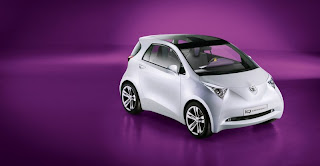
The New Toyota iQ

I would never buy this car, but I must say it impresses me greatly! It is the smallest four seater in the world. If we remind ourselves of the smart that came out several years ago, we remember seeing it parked in the smallest most amazing spaces in the city, that werent even proper parking spaces. This car is probably the same size, if not smaller than the smart and its a four seater. The iQ is the new "urban city car". Its also called the "car of the future". Its audience is people who live in big cities, but still want to travel by car. It meets the expectations, with its inner and outer design, of modern city people. It is also said to be fairly eco-friendly. It is the perfect town car of the future.

Mittwoch, 4. Februar 2009

Rob

Rob is the best and he is amazing.
He is a great design, and he is design of the year

FONTS-Urban Love

Dienstag, 3. Februar 2009

Design of the week 14
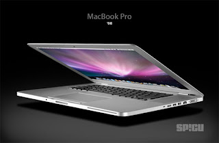
MacBook Pro

The new MacBook Pro is the worlds thinnest and lightest 17inch notebook. Apple brings out new products very often, so its not a surprise that once again they managed to impress with their newest 17inch macbook. The Notebook has improved battery life and a high resolution display. It has now a built in battery, that can be recharged up to 1000 times and "2.3million pixels of perfection". It also has a new multi touchpad. Its pretty impressive, its and amazing design and it looks great, but then again whats the point of buying it, since in a few months its going to be old news and apple will amaze us with a new product.

Design of the week 13

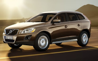
The New Volvo XC60

The XC60 is a bit similar to the XC90, which has been around for a very long time, but was redesigned very often. The XC60 is supposedly the safest Volvo ever. Its a very interesting design, because it is not as big as an XC and looks a bit like a smaller car, it still belongs to the XC series due to its big wheels, its robust looking front and its in reality pretty big size. Volvo wants to fulfill everyones needs with this new design. Its meant for people who have the V30 and want a car to drive around the city with, because one of the slogans is "City Safety", but then it is also for people who want an SUV, "a newer XC90". It has the newest Volvo technology and Volvo thinks that with this new model, there will be more buyers, than with the XC90, since its a great car for anyone. 

Sonntag, 1. Februar 2009

Design of the week 12
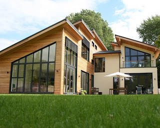
Eco House= Form Follow Function

Eco-houses have become pretty popular and many of the new houses that are being built are eco-houses. These are zero energy/ carbon neutral. The eco-houses use wind power, solar power, heat recovery systems and more. Even though eco-houses are more expensive, in the end they are cheeper, because the monthly payments, such as energy and heating become so much cheeper. Eco-houses are so much better for the environment and a great design.

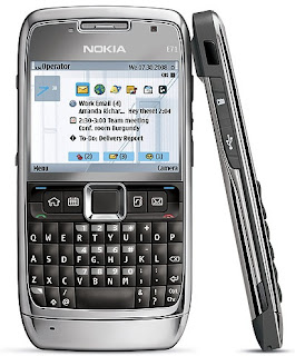
Design of the week 11 ( 2009)

The Nokia E71 is a great design and a great phone. Its competing with the iPhone 3G and the Blackberry Bold. In some areas its even better than the other two phones. In size its very small for what it has to offer. The internet connection is not as quick as the blackberrys, but its probably the same as the iPhones. Even though the design of the blackberry bold is the cleanest and sharpest blackberry ever come out, a lot of people argue that the leather back is too old modern and should not be on a phone. The battery life of the Bold and E71 is the same. Both are great designs, but in my opinion the E71 looks and is better.

Donnerstag, 15. Januar 2009

New Colors for Miami Feel

Pink, Purple, Blue and Gold

Rule of Thirds- Picture Positioning

Western audience reads from the left to right.
So the more dominant, stronger, better, more important will be on the left.
For example in movies, if there is a fight the winning character will be on the left, if the other character starts winning, they literally switch positions.