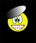
 I used the duplicate tool a lot. I also used the gradient tool for the eyes and mouth.
Donnerstag, 27. November 2008
Dienstag, 25. November 2008
Design of the Week 8.
 Yellow Pages Business Card Holder
Sonntag, 23. November 2008
Donnerstag, 20. November 2008
Color Combinations and Contrast
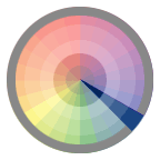
Monochromatic Relationship Colors that are shade or tint variations of the same hue.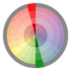
Complementary Relationship Those colors across from each other on a color wheel.
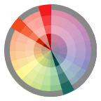
Split-Complementary Relationship One hue plus two others equally spaced from its complement.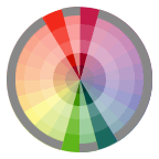
Double-Complementary Relationship Two complementary color sets; the distance between selected complementary pairs will effect the overall contrast of the final composition.
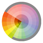
Analogous Relationship Those colors located adjacent to each other on a color wheel.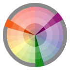
Triad Relationship Three hues equally positioned on a color wheel.
COLOR AND CONTRAST
If there is not a lot of contrast between colors( like yellow and white) it will be very hard to read. If there is a lot of contrast between vibrant colors, like blue and red it could cause illusions.The contrast of saturation
 The contrast is formed by the juxtaposition of light and dark values and their relative saturation.
The contrast of light and dark
 The contrast is formed by the juxtaposition of light and dark values. This could be a monochromatic composition.
The contrast of extension
 Also known as the Contrast of Proportion. The contrast is formed by assigning proportional field sizes in relation to the visual weight of a color.
The contrast of complements
 The contrast is formed by the juxtaposition of color wheel or perceptual opposites.
Simultaneous contrast
 The contrast is formed when the boundaries between colors perceptually vibrate. Some interesting illusions are accomplished with this contrast.
The contrast of hue
 The contrast is formed by the juxtaposition of different hues. The greater the distance between hues on a color wheel, the greater the contrast.
The contrast of warm and cool
 The contrast is formed by the juxtaposition of hues considered 'warm' or 'cool.'
Color Wheel and Complementary Colors
 Primary Colors
 Secondary Colors
 Tertiary colors ( created with secondary and primary colors)
 Analogous Colors
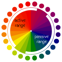 The color wheel can be divided into ranges that are visually active or passive. Active colors will appear to advance when placed against passive hues. Passive colors appear to recede when positioned against active hues.
COMPLEMENTARY COLORS
To call those hues in direct opposition to each other "complements of each other" is appropriate. Complementary colors bring out the best in each other. When fully saturated complements are brought together, interesting effects are noticeable. This may be a desirable illusion, or a problem if creating visuals that are to be read.
Note that Vibrating Boundaries may occur when opposing colors are brought together.
(Notice the illusion of highlighted edges and raised text.)

COLOR NOTES
Color Theory:
-If you are involved in the creation or design of visual documents, an understanding of color will help when incorporating it into your own designs. Choices regarding color often seem rather mystical, as many seem to base decisions on nothing other than "it looks right." Although often told I had an eye for color, the reason why some colors worked together while others did not always intrigued me and I found the study of color theory fascinating.
-Chroma, intensity, saturation and luminance/value are inter-related terms and have to do with the description of a color.
Chroma: How pure a hue is in relation to gray
Saturation: The degree of purity of a hue.
Intensity: The brightness or dullness of a hue. One may lower the intensity by adding white or black.
Luminance / Value: A measure of the amount of light reflected from a hue. Those hues with a high content of white have a higher luminance or value.
Shade and tint are terms that refer to a variation of a hue.
Shade: A hue produced by the addition of black.
Tint: A hue produced by the addition of white.
Subtractive Color. When we mix colors using paint, or through the printing process, we are using the subtractive color method. Subtractive color mixing means that one begins with white and ends with black; as one adds color, the result gets darker and tends to black.
Those colors used in painting—an example of the subtractive color method

Additive Color. If we are working on a computer, the colors we see on the screen are created with light using the additive color method. Additive color mixing begins with black and ends with white; as more color is added, the result is lighter and tends to white.
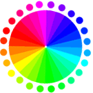 Percentages of red, green, & blue light are used to generate color on a computer screen.
Mittwoch, 19. November 2008
Design of the week 7.

Mittwoch, 12. November 2008
Design of the Week 6.


Dienstag, 4. November 2008
Sources:
http://en.wikipedia.org/wiki/Experimental_jetset
I did not find a lot of information on wikipedia. It was not detailed, but I liked it because it had the most important and basic information about Experimental Jetset, which helped me get started.
http://www.aisleone.net/2008/intervista/intervista-experimental-jetset/
“Intervista: Experimental Jetset”, an entry on AisleOne
An inspirational resource focused on graphic design, typography, grid systems, minimalism and modernism.
This entry on this cool site provides information on
http://www.experimentaljetset.org/archive/sun6.html
A very simple concept, which worked surprisingly well: the combination of reading and listening proved to be stronger than we expected. So for this lecture, we decided to do something similar. Why not? This website is Experimental Jetsets website, I looked at most of their designs and posters and read about how they thought of it. This website was good, because it obviously had the most information about experimental jetset, but it was very complicated.
http://www.dandad.org/buy/lectures/lecture5.html Heavily influenced by mid-1980’s post-punk culture. EJ Focus on printed matter, installation work and T-Shirtism. This website did not give me any new information but it was good, because it summarized the main points of a different website I had gone on before, that had a lot of writing.
http://www.helveticafilm.com/poster1.detail.html, This website showed one of their posters, that was about Helvetica and letters, it was quite interesting to read.
Montag, 3. November 2008
Design of the week 5.

Neatorama
Design of the week 4.

Ungarbage
Design of the week 3.
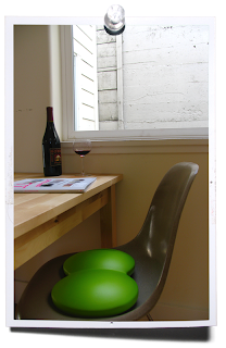
CritBuns


