Dienstag, 16. Dezember 2008

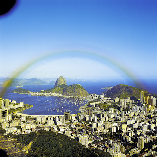
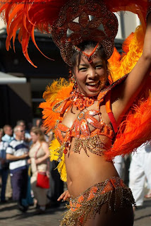
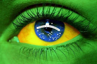
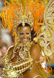
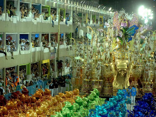
Rio Feel


- Vibrant Colors
- Green, Yellow, Blue

- Gold and Red


Green, Yellow, Blue: sun, light, sunshine, joy, happiness, energy, cheerfulness, purity, enthusiasm, warmth, optimism, imagination, summer, restlessness, glory. water, sea, creativity, peace, freedom, love, trust, loyalty, understanding, confidence, relaxation, affection, inspiration, friendship, infinity, harmony. (palm trees. Water) earth mother, physical healing, monetary success, abundance, freshness, refreshing, youth, trees, grass, harmony, joy, love, soothing, friendliness


Gold and Red wealth, winning, happiness, playful humour, prestige, spiritual love, desire for power. Energy, strength, passion, eroticism, cheerfulness, element of fire, desire, vibrancy, love, strength, power, good-tasting, excitement, heat, warmth, attention.


Miami Feel


Miami Look

Color Schemes:
Yellow: sun, light, sunshine, joy, happiness, energy, cheerfulness, purity, enthusiasm, warmth, optimism, imagination, summer, restlessness, glory.
Blue: water, sea, creativity, peace, freedom, love, trust, loyalty, understanding, confidence, relaxation, affection, inspiration, friendship, infinity, harmony, 
Turquoise.
Green: (palm trees. Water) earth mother, physical healing, monetary success, abundance, freshness, refreshing, youth, trees, grass, harmony, joy, love, soothing, friendliness
Gold: wealth, winning, happiness, playful humour, prestige, spiritual love, desire for power.
Pastel Colors


Donnerstag, 4. Dezember 2008

Last Post 2008- Looking at other blogs.

Felix 
Sakkti
Barak
Ziv
Article of the Week 1- iPod Touch
Article of the Week 2- Google
Article of the Week 3- Branding
Article of the Week 4- Easy ways to improve websites legibility
Article of the Week 5- The logo designer 
Article of the Week 6- Business Cards
Article of the Week 7- Domain 
Nicki
Weekly Article- New Ipod Nano
Article of the Week- Furniture Massimo Vignelli
Weekly Article- Colors
Weekly Article- David Carson
Weekly Article- Post Modernism
Article of the Week- Modbook
Article of the Week- Design Cycle
Article of the Week- New Adidas Shoes 
Article of the Week- Blackberry Storm

The three posts that I found most interesting, were Felix post on the new Salmon Ski Boot, Nicki's post on the Modbook and finally Barak's post about the different bizarre iPod cases. 

It was pretty interesting to read about the new ski boot with the newest technology. Not like it surprised me that Salmon had made a ski boot that "guarantees perfect fit" and that "permits perfect control" with its new "Advanced Shell Technology", but I enjoyed reading about the newest on the market and how far ski boot has come, that it can be switched between 2 modes "skiing mode" and "walking mode".

The Modbook article was extremly surprising, at first I thought it was a joke, since we have the IBM tablets at our school and it looked very similar, just a thousand times better. Its a great new design, since the lenovo tablets are pretty cool, their just crap quality, ugly, and dont have too many good programs on them. This is why I feel that making a "mac tablet" is a wonderful idea, since macs are great and have a lot of cool programs.

The iPod case post was really fun to read. This post was about several bizarre iPod cases, such as a bullet proof iPod case, which I dont think too many people would have thought of. I doubt that anyone would ever buy it to use it for what its meant to be used for, but its a pretty funny idea. Another one was the Fluffpod, which was a furry case, this was not a very creative idea, but I liked the name. Lastly there was the iKitty, a case in form of a cat, this one also sounded cool.


Dienstag, 2. Dezember 2008

Design of the Week 9.

dupli-casa1.jpg


This weeks design is the Dupli Casa. The Dupli Casa is a really cool design of a house. It was designed by Juergen Mayer H. 


"It connects the inside with the outside, up with down, air with ground and — most cleverly — past with present and even future.

The views from the inside are amazing, especially from the vast ground-level openings that again, give the sensation of flying, being airborne, weightlessness. Everything is fluid, flowing and smooth.

All of this is very much in keeping with the main inspiration for the house. The new residence follows the footprint of the previous dwelling and its numerous extensions. The idea was to let the ‘family archaeology’ continue in the new building. It’s a house that remembers its beginnings in 1984 yet projects boldly into the future."

dupli-casa5.jpg


dupli-casa2.jpg

ABC Telecom Logo

My Logo is for a Telephone Company. The colors I chose were dark turquoise, black and white. The white contrasts well with the black and the turquoise. The black and the white are simple colors and the turquoise makes it a bit more interesting. The turquoise represents communication, protection and sophistication. The black represents sophistication, protection, style, seriously and reliability. White represents clarity, perfection, fairness and safety.

Donnerstag, 27. November 2008

SMILEY

I used the duplicate tool a lot. I also used the gradient tool for the eyes and mouth.

Dienstag, 25. November 2008

Design of the Week 8.

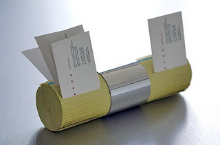
Yellow Pages Business Card Holder


The Yellow-Pages card holder is a pretty cool design. It looks like a yellow pages phonebook rolled up and kept that way with a silver ring like thing. It looks useful and very creative, but I don't think that too many people would want to have that in their house. Its just weird and useless, unless of course you need place in your house to put all the business cards. I decided to make this my weekly design, because I would have never thought of something like that and also found it pretty funny.


Donnerstag, 20. November 2008

PLAYING WITH COLOR

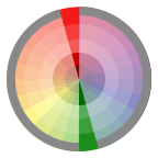
Analogous Relationship


Triad Relationship


Color Combinations and Contrast

COLOR COMBINATIONS

Monochromatic Relationship
Monochromatic Relationship Colors that are shade or tint variations of the same hue.
Complementary Relationship
Complementary Relationship Those colors across from each other on a color wheel.

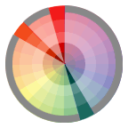
Split-Complementary Relationship
Split-Complementary Relationship One hue plus two others equally spaced from its complement.
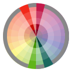
Double-Complementary Relationship
Double-Complementary Relationship Two complementary color sets; the distance between selected complementary pairs will effect the overall contrast of the final composition.

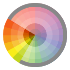
Analogous Relationship
Analogous Relationship Those colors located adjacent to each other on a color wheel.
Triad Relationship
Triad Relationship Three hues equally positioned on a color wheel.


COLOR AND CONTRAST
If there is not a lot of contrast between colors( like yellow and white) it will be very hard to read. If there is a lot of contrast between vibrant colors, like blue and red it could cause illusions.


The contrast of saturation

Contrast of saturationThe contrast is formed by the juxtaposition of light and dark values and their relative saturation.

The contrast of light and dark

Contrast of light and darkThe contrast is formed by the juxtaposition of light and dark values. This could be a monochromatic composition.

The contrast of extension

Contrast of ExtensionAlso known as the Contrast of Proportion. The contrast is formed by assigning proportional field sizes in relation to the visual weight of a color.
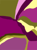
The contrast of complements

Contrast of complementsThe contrast is formed by the juxtaposition of color wheel or perceptual opposites.
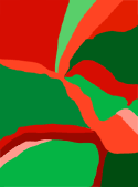
Simultaneous contrast

Simultaneous contrastThe contrast is formed when the boundaries between colors perceptually vibrate. Some interesting illusions are accomplished with this contrast.
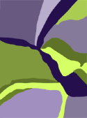
The contrast of hue

Contrast of hueThe contrast is formed by the juxtaposition of different hues. The greater the distance between hues on a color wheel, the greater the contrast.
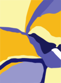
The contrast of warm and cool

Contrast of warm and coolThe contrast is formed by the juxtaposition of hues considered 'warm' or 'cool.'

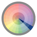
Color Wheel and Complementary Colors

primary.gifPrimary Colors 

secondary.gifSecondary Colors

tertiary.gifTertiary colors ( created with secondary and primary colors)

analogous.gifAnalogous Colors


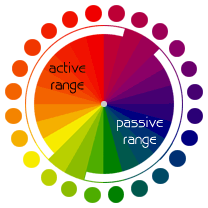
color wheel displaying active - passive rangesThe color wheel can be divided into ranges that are visually active or passive. Active colors will appear to advance when placed against passive hues. Passive colors appear to recede when positioned against active hues.


COMPLEMENTARY COLORS


To call those hues in direct opposition to each other "complements of each other" is appropriate. Complementary colors bring out the best in each other. When fully saturated complements are brought together, interesting effects are noticeable. This may be a desirable illusion, or a problem if creating visuals that are to be read.

Note that Vibrating Boundaries may occur when opposing colors are brought together.

(Notice the illusion of highlighted edges and raised text.)


yellowgreen-redpurple.gif

COLOR NOTES

Color Theory:

-If you are involved in the creation or design of visual documents, an understanding of color will help when incorporating it into your own designs. Choices regarding color often seem rather mystical, as many seem to base decisions on nothing other than "it looks right." Although often told I had an eye for color, the reason why some colors worked together while others did not always intrigued me and I found the study of color theory fascinating.

-Chroma, intensity, saturation and luminance/value are inter-related terms and have to do with the description of a color.


Chroma: How pure a hue is in relation to gray 
Saturation: The degree of purity of a hue. 
Intensity: The brightness or dullness of a hue. One may lower the intensity by adding white or black. 
Luminance / Value: A measure of the amount of light reflected from a hue. Those hues with a high content of white have a higher luminance or value.

Shade and tint are terms that refer to a variation of a hue.


Shade: A hue produced by the addition of black. 
Tint: A hue produced by the addition of white.


Subtractive Color. When we mix colors using paint, or through the printing process, we are using the subtractive color method. Subtractive color mixing means that one begins with white and ends with black; as one adds color, the result gets darker and tends to black.

Those colors used in painting—an example of the subtractive color method

small-painters-wheel.gif


Additive Color. If we are working on a computer, the colors we see on the screen are created with light using the additive color method. Additive color mixing begins with black and ends with white; as more color is added, the result is lighter and tends to white.


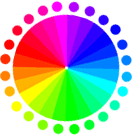
RGB color wheelPercentages of red, green, & blue light are used to generate color on a computer screen.


Mittwoch, 19. November 2008

COLORS

http://www.sibagraphics.com/colour.php

Design of the week 7.


This weeks "good-design" goes to the new nano-chromatic. It is one of the newest apple ipods and it is available from the low price of $149. This is very unusual, since the ipod nano 3rd generation, which also had less GB than the new one, cost $299. The nano has interesting new features such as "genius" and "shake-control". It is also the thinest ipod ever and it is the series with the biggest range of colors. I think its a very nice design, except for that its to much like the nano 2nd generation, since some of the colors are similar and the shape is almost the same. Of course the new nano has a way cooler screen, on which you can watch movies quite well, and better than on the 3rd generation. 

Mittwoch, 12. November 2008

Design of the Week 6.


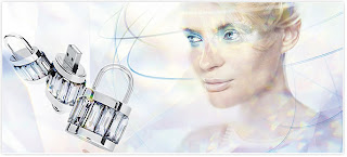
A few days ago I came across something very interessting in Zurich, Swarovski Headphones and USB sticks. I knew they were on the market, due to several friends having these very expensive headphones, but when I saw that they had them in around 5 different colors and USB sticks covered in heart shapes, I was pretty curious. The swarovksi headphones cost around 130 franks and I find it kind of funny, as the Apple Headphones that cost 30 franks, and in my oppinion are pretty good work for around 6 months and this is for someone who uses them every day. My friends "swarovski headphones" stopped working after 2 weeks and yes they were replaced, but still. Now Phillips and Swarovski have started making USB sticks, that probably also cost more than 100 franks. I can't really think of anyone who would want to wear a USB stick as a necklace all day, the other thing is that its happened pretty often that I found a USB stick lying around or plugged into a computer and forgotten. I think it would kind of suck to loose something that is worth over a hundredfranks.

Dienstag, 4. November 2008

Sources:

http://en.wikipedia.org/wiki/Experimental_jetset

I did not find a lot of information on wikipedia. It was not detailed, but I liked it because it had the most important and basic information about Experimental Jetset, which helped me get started.

http://www.aisleone.net/2008/intervista/intervista-experimental-jetset/

Intervista: Experimental Jetset”, an entry on AisleOne

AisleOne


An inspirational resource focused on graphic design, typography, grid systems, minimalism and modernism.

This entry on this cool site provides information on

http://www.experimentaljetset.org/archive/sun6.html

 A very simple concept, which worked surprisingly well: the combination of reading and listening proved to be stronger than we expected. So for this lecture, we decided to do something similar. Why not? This website is Experimental Jetsets website, I looked at most of their designs and posters and read about how they thought of it. This website was good, because it obviously had the most information about experimental jetset, but it was very complicated.

http://www.dandad.org/buy/lectures/lecture5.html                                                Heavily influenced by mid-1980’s post-punk culture. EJ Focus on printed matter, installation work and T-Shirtism. This website did not give me any new information but it was good, because it summarized the main points of a different website I had gone on before, that had a lot of writing.

http://www.helveticafilm.com/poster1.detail.html,                                                                         This website showed one of their posters, that was about Helvetica and letters, it was quite interesting to read. 

Montag, 3. November 2008

Design of the week 5.


Neatorama 


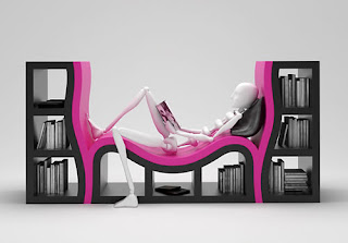
This bookshelf is a design by Stanislav Katz, I find it quite odd, and i would not buy it, but i still think its a pretty cool design. In my opinion it could also be considered a good design, because it actually has a use, one can read comfortably, and access books without moving. Even though it looks pretty modern, I dont think its going to be popular for the next 50 years, like the Bic pen. 

Design of the week 4.


Ungarbage


Is a website created by Mourylise Heymer Marreiors, a graphic designer. The website is about her and her projects. Her website is pretty interesting and her projects are for example Leica Microsystems, Fujifilm Portugal, Clunex Portugal, Imporsan and many more. I find her style different, but I like it. 

Her website is called Ungarbage, because many websites are being discarded, because they are useless. She says that for a website to be worth looking at, it must be quick, useful, visible, accessible and valuable.  

Design of the week 3.


CritBuns


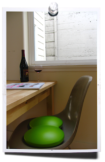
CritBuns is a very simple, but useful and interesting design by Joe Gebbia. Crit, which is supposed to represent "critical", is the representation of a students artwork before their professors and peers. It is the staple of every art and design school

CritBuns also has a website which is, in my opinion very well designed, fun and easy to use

The actual Critbuns were designed, because Joe Gebbia wanted to design a simple,comfortable and portable seat cushion. He was frustrated, because there was nothing on the market that fulfilled his expectations of a perfect seat cushion, so he designed his own, and created something very simple that designers were trying to create through complicated ways. 

Dienstag, 28. Oktober 2008

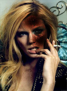
Photoshop Tools ( dodge, burn and sponge tool)

The sponge tool takes out the color of a picture. It sucks the color out of pictures.


The burn tool is supposed to make things look burned. The more you go over something the darker it gets.


The dodge tool lightens things. The more you go over something, the lighter it gets.